Nothing has always taken a slightly different approach to Android software. While Nothing phones already stand out because of their transparent designs and Glyph lights, Nothing OS adds another layer of personality with its clean interface and simple design. With Nothing OS 5.0, the company is not trying to completely change the experience. Instead, it…
Nothing has always taken a slightly different approach to Android software. While Nothing phones already stand out because of their transparent designs and Glyph lights, Nothing OS adds another layer of personality with its clean interface and simple design. With Nothing OS 5.0, the company is not trying to completely change the experience. Instead, it focuses on several smaller improvements while keeping the familiar look intact.
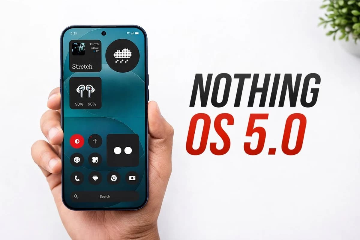
Based on Android 17, Nothing OS 5.0 brings updates to the interface, personalisation, widgets, Glyph controls and the company’s AI-powered Essential tools. I tested the beta version on the Nothing Phone 3 to see how these changes work in everyday use.
Nothing OS 5.0 Performance and Design
The first thing I noticed about Nothing OS 5.0 is that it still feels familiar. The company has retained the overall design language from previous versions, which is a good thing. The interface remains clean, while changes to icons, typography, animations, Quick Settings and the lock screen make the experience feel more consistent.
Performance was also smooth during regular use. Scrolling through menus, switching between applications and opening apps felt responsive, even though this was a beta version. Nothing says it has worked on app launches, touch response, multitasking and background app management, although these improvements are difficult to measure after only a few days.
There are also some practical changes. Bluetooth controls in Quick Settings are simpler, while users can move multiple apps and widgets together on the home screen. The Glyph Interface now has its own dedicated application, making its controls easier to access.
Three Nothing OS 5.0 Features I Liked
1. Away Time
Away Time is one of the more useful additions in Nothing OS 5.0. Instead of simply showing how much time you spend on your phone, it tracks your longest periods away from the device and displays your weekly habits.
I like this approach because it feels less like a warning and more like a gentle reminder. The accompanying widget also follows Nothing’s minimal design and does not take up much space.
2. Dedicated Glyph App
The new Glyph app makes controlling the Glyph Interface much easier. Lighting settings, sounds, ringtones and schedules are brought together in one place.
It may not seem like a major update, but it removes the need to search through different Settings menus. For regular Nothing phone users, this should make the Glyph experience more convenient.
3. Better Essential AI Features
Nothing OS 5.0 also expands its AI features. Essential Space gets Smart Collections, while Essential Voice offers faster processing and cleaner transcriptions.
The upcoming Essential Apps Builder is arguably the most interesting addition. It allows users to create simple apps by describing what they want in natural language. It gives Nothing OS a more experimental side without making the software complicated.
One Feature I Could Skip
Not every addition feels equally useful. TCollector lets users remove the main subject from a photo and place the resulting cutout in a Collector widget. It can be fun for a while, but I am not sure how often most users will return to it.
Verdict
Nothing OS 5.0 is more of an evolution than a major redesign. The software keeps the clean experience that Nothing users already like while adding useful improvements to Glyph controls, widgets and AI tools. Some features are more practical than others, but overall, Nothing OS 5.0 feels like a thoughtful update rather than a complete change.